Does Safari 15 finally fix viewport height?
Written by Luke Channings on June 11, 2021
The design for Safari 15 has been very controvercial, and has changed significantly since the beta that this article was based on Sadly, one of the casualties of the evolving design was the main thrust of this article: env(safe-area-inset-bottom) is no longer dynamically the height of the address bar in the final release.
TL;DR: No, but if you subtract .env(safe-area-inset-bottom) from 100vh you'll get what you want
Safari 15's UI is a radical departure from the previous version — and from web browsers in general — but does it fix the viewport height problem?
What is the viewport height problem again?
Mobile Safari has had problems related to 100vh not behaving like web developers expect1 2 pretty much since the beginning.
The main crux of the issue is that Mobile Safari's UI Chrome shrinks when you scroll, and expands again when you activate it.
That means 100vh ("100% the height of the viewport") can't be a static number.
Let's start by understanding the definition of the vh unit 3:
vhis defined asEqual to 1% of the height of the initial containing block.
And here's the best explanation of the 100vh issues in Mobile Safari that I've seen so far,
The core issue is that mobile browsers (I’m looking at you, Chrome and Safari) have a “helpful” feature where the address bar is sometimes visible and sometimes hidden, changing the visible size of the viewport.
Rather than adjusting the height of
100vhto be the visible portion of the screen as the viewport height changes, these browsers instead have100vhset to the height of the browser with the address bar hidden.The result is that the bottom portion of the screen will be cut off when the address bar is visible, thus defeating the purpose of
100vhto begin with.
Let's put this new Safari to the test
I have a simple HTML page based on the example given in David's article.
It has a header at the top and a button at the bottom, all wrapped in a 100vh container.
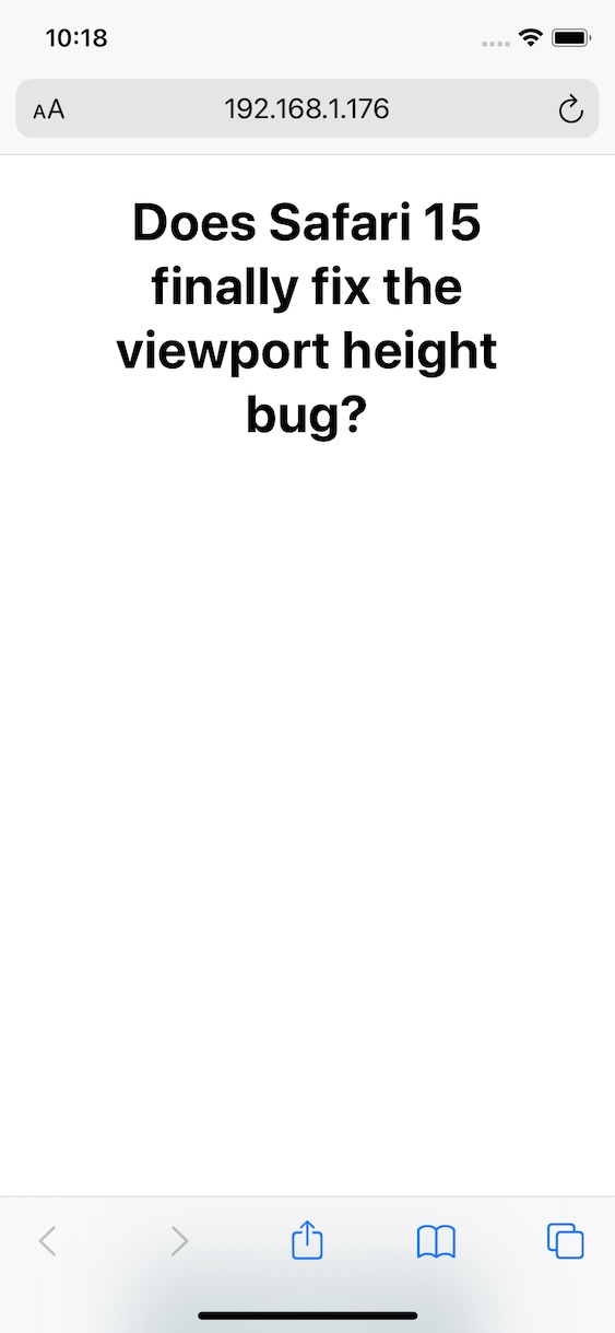
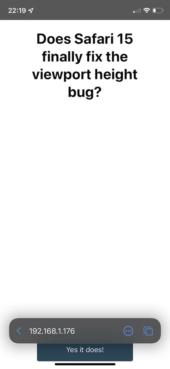
Safari's new floating address bar is displayed above our test button, which is more-or-less exactly the same behaviour as iOS 14.
So - Safari 15 does not change the behavour of 100vh 😢.
So what's the solution then?
It makes sense to me that the WebKit team wouldn't change the behaviour of the viewport unit, it's already well defined.
Do you remember when Apple introduced env() and safe-area-inset so
that web developers could avoid their content being shown behind the notch4?
Well in Safari 14, safe-area-inset-bottom is 0px whether the UI chrome is active or inactive,
which is something that has annoyed me for a while.
safe-area-inset-bottom is 0px when the UI chrome is inactive in Safari 15 on iOS,
and then the height of the collapsed chrome minus the height of the expanded chrome when the bar is expanded.
That means that to get a button to float at the bottom of the page, always above the UI Chrome, all you have to do is use calc(100vh - env(safe-area-inset-bottom)).
Wrapping up
So not only does safe-area-inset-bottom work in Safari 15, it's animated!
I've been hoping that something to remedy the viewport height bug was coming since Jen Simmons (who joined the Safari / WebKit team in June 2020) was asking for feedback regarding viewport height issues.
Hey everyone who’s been frustrated that VH units in CSS don’t do what you need… can you describe your usecase? What layout are you creating? With which layout mechanism? What do you need? Screenshots & sample code appreciated.
— Jen Simmons (@jensimmons) May 15, 2021
Have a feeling I’m going to be talking about Environment Variables a lot this week. They are really cool & supported!
— Jen Simmons (@jensimmons) June 7, 2021
https://developer.mozilla.org/en-US/docs/Web/CSS/env()
https://caniuse.com/css-env-function
padding-bottom: calc(1rem + env(safe-area-inset-bottom));
-or-
height: calc(100vh - env(safe-area-inset-bottom));